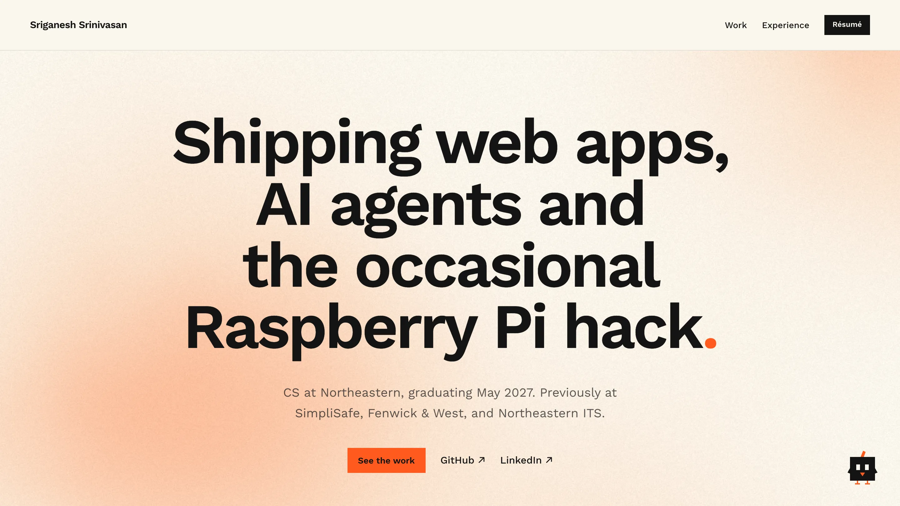
Design choices
I treated the site as a project of its own, so every choice is deliberate:
- Orange. It’s my favorite color, and to me it stands for curiosity. I use it sparingly so it means something: the full stop at the end of headlines, link underlines, the main button, and Hubert’s beak, feather and legs. Everything else is creme, white and black.
- Minimal and boxy. My first mockup leaned neo-brutalist, with thick borders and hard shadows. I stripped it back to sharp corners, thin 1px lines and no shadows, so the work is what stands out.
- Hubert. My main audience is recruiters who want to find things quickly. So instead of making them hunt, a small guide in the corner offers shortcuts: all projects, AI work, full-stack work, experience, my résumé, or how to reach me. He takes you there and applies the right filter. He’s a bird because I love birds (see the bird feeder detector).
- A quiet hero. A soft orange glow drifts behind the headline through a small WebGL shader, with a film-grain finish. It pauses when it’s off screen and holds still for visitors who prefer reduced motion.
Hubert’s easter eggs
Spoilers, if you’d rather find them yourself:
- He flies you there. Ask him for my experience, my résumé or how to reach me, and he takes off as the page scrolls, flies in an arc to that section’s heading, perches beside it to say his piece, then flies back to his corner. For the work filters he stays put and answers from the corner.
- He gets dizzy. Click him five times in a row and he spins: “Whoa… I’m seeing two of you.”
- He keeps bird hours. Between 10 pm and 6 am in your time zone his eyes droop, little z’s float up, and he greets you with a yawn. Opening his menu wakes him up.
- He has a favorite project. Hover the bird feeder detector on the home page and he chirps “A fellow bird!”
- He gets lost too. Any page that doesn’t exist shows Hubert puzzling over a map: “This page flew the coop.”
All of it respects reduced-motion settings: no flights or spins, just his replies.
Why Astro
A portfolio is mostly content that doesn’t change between visits, so I chose a framework built for content sites rather than apps:
- Static HTML by default. Astro renders every page at build time and ships no JavaScript unless a part of the page needs it. Here, that’s just three small scripts: the glow, the filters and Hubert. No React runtime downloads at all.
- Typed content. Each project is an MDX file whose fields are checked against a Zod schema. A missing date or a misspelled category fails the build instead of shipping a broken page. It’s like a typed database that lives in git.
- No lock-in. I know React and Next.js, and Astro can drop in a React component as an “island” if part of the page ever needs real interactivity.
How it works
Videos don’t belong in git, so npm run media compresses each clip with ffmpeg into MP4 and WebM, saves a poster frame for the page, and uploads the files to Cloudflare R2. Every file is marked as never changing, so Cloudflare’s edge can cache it indefinitely. I measured the difference from Boston (median of 7 downloads each):
| Clip | First byte, uncached | First byte, cached |
|---|---|---|
| TV Ambilight (1.8 MB) | 124 ms | 60 ms |
| Room strip (2.2 MB) | 149 ms | 69 ms |
| SimpliSync demo (1.1 MB) | 135 ms | 73 ms |
Full downloads got about 30% faster too, around 150–170 ms instead of 220–250 ms.